The 150-Year Market Map That Predicted Every Crash — Including What’s Next in 2025

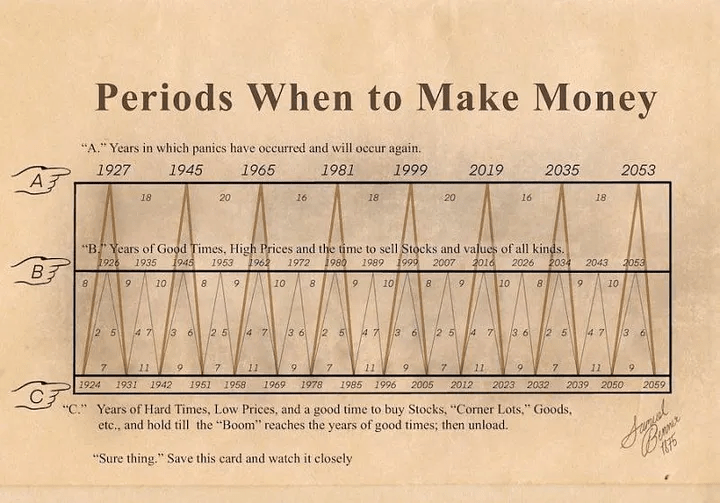
Markets feel chaotic in the moment. Crashes seem sudden, bubbles look irrational, and recoveries often appear like miracles. But history tells a different story: financial markets move in cycles—predictable, almost rhythmic patterns that have repeated for over 150 years.

What if I told you there’s a map—a historical blueprint—that not only explains every major boom and bust but also gives us strong clues about where we’re heading in 2025?


The Cycles Hidden in Plain Sight

When you zoom out far enough, short-term noise disappears, and long-term patterns emerge. Economists and historians have tracked several recurring cycles, but three stand out:

  • Kondratiev Waves (40–60 years): Long cycles driven by technological revolutions and infrastructure buildouts. Steam, railroads, electricity, oil, the internet—all sparked massive booms, followed by crashes.
  • Kuznets Cycles (15–20 years): Linked to investment in housing, demographics, and migration.
  • Juglar Cycles (7–11 years): Classic business cycles of expansion and recession.

Overlay these cycles on a 150-year market map, and something fascinating happens: the Great Depression (1929), Dot-Com Bust (2000), Global Financial Crisis (2008), and even the COVID crash (2020) all align almost perfectly with these waves.

History may not repeat exactly, but it certainly rhymes.


Every Crash, Every Time

  • 1929 Crash & Depression: The end of a Kondratiev wave powered by industrial expansion.
  • 1970s Stagflation: A cycle peak fueled by post-WWII rebuilding, ending in inflation and oil shocks.
  • 2000 Dot-Com Bubble: A tech-driven Kuznets-Juglar alignment that snapped under its own weight.
  • 2008 Financial Crisis: A Kuznets housing cycle collapse, amplified by financial engineering.
  • 2020 Pandemic Shock: An external trigger landing right at the tail of a Juglar cycle.

The map isn’t magic—it’s math + psychology. Human behavior (fear, greed, over-confidence) drives markets the same way it did a century ago. Combine this with debt cycles, demographics, and technology shifts, and the rhythm becomes clear.


So What About 2025?

If history holds, 2025 looks like the intersection of two powerful forces:

  1. Debt & Liquidity Squeeze
    The last decade was defined by cheap money and explosive debt. Rising interest rates now act as a global stress test. Historically, debt bubbles unwind painfully—2025 could mark the breaking point.
  2. Tech Hype vs. Reality
    AI, blockchain, and green tech are driving a new Kondratiev-style boom. But every tech revolution has its bubble phase before real adoption matures. The “AI everything” narrative feels eerily similar to the 1999 internet euphoria.
  3. Geopolitical Fractures
    Major wars, supply chain realignments, and the de-dollarization trend are reshaping global finance. History shows that market shocks often align with geopolitical stress.

Put simply: the 150-year map suggests that 2025 won’t be just another year—it could be the pivot point of the next great reset.


How to Think About It

The point isn’t doom-scrolling or fear. It’s preparation.

  • Crashes aren’t endings—they’re transitions.
  • Every market bust of the last 150 years created the foundation for the next growth wave.
  • The winners aren’t those who avoid volatility but those who understand it and position wisely.

If the map is right, 2025 may bring turbulence—but also once-in-a-generation opportunities.


Final Thought

The 150-year market map isn’t a crystal ball. It’s a reminder that cycles, not randomness, drive history.

We’ve seen this movie before—every crash, every recovery, every new boom. And if the patterns hold, 2025 could be one of the most decisive chapters yet.

The real question isn’t whether the storm is coming. It’s whether you’ll be prepared to navigate it.

Why Most People Are Dead Wrong About Global Wealth (The Numbers Will Shock You)

When we think about wealth, we all believe we have some idea of where we stand. We imagine the “wealthy elite” as billionaires on magazine covers, the “middle class” as ordinary professionals in developed countries, and the “poor” as those struggling in less developed economies. But the truth is far more surprising—and in many ways, far more uncomfortable.

The reason? Our perception of wealth is broken.

Most of us dramatically overestimate how much wealth the average person has, and underestimate how extraordinary even “ordinary” savings or property can look on a global scale. The gap between perception and reality is staggering, and two simple questions can reveal just how misunderstood the landscape of global wealth really is.


The Two Questions That Expose Our Blind Spots

Let’s run a thought experiment.

  1. What percentage of adults in the world own more than $10,000 in assets?
  2. How many people on Earth do you think qualify as millionaires (assets above $1 million)?

Take a guess before reading on.

Most people imagine that at least half the world has $10,000 in assets. And when asked about millionaires, guesses often range in the tens or even hundreds of millions.

The reality?

  • Roughly 70% of adults worldwide own less than $10,000 in total assets.
  • Just 1% of people globally qualify as millionaires.

That means if you own more than $100,000 in property, savings, or investments, you’re not middle class—you’re in the top 10% globally.

And if you’re a millionaire in net worth, congratulations—you are among the rarest 1% of humanity. What feels “ordinary” in one country is “extraordinary” in the world.


The Global Wealth Pyramid

The clearest way to see this imbalance is through what economists call the “global wealth pyramid.” According to Credit Suisse’s latest Global Wealth Report:

  • Bottom 50% of adults — control just 2% of total global wealth. That’s half of humanity living with almost nothing in terms of assets.
  • Next 40% — together hold about 38% of the wealth, spread thinly across billions of people.
  • Top 10% — control nearly 60% of all wealth on Earth.
  • Top 1% — hold more wealth than the entire bottom 90% combined.

This isn’t just inequality—it’s concentration at an extraordinary scale. Imagine a room of 100 people representing the world. One person in the corner controls more wealth than the other 90 people put together.


Why Do We Misunderstand Wealth So Badly?

The numbers are shocking, but the real question is: why are most people so wrong in their assumptions?

There are a few key reasons:

  1. Relative Perspective
    Humans compare themselves to those around them. If you live in a developed country, you measure your situation against neighbors, coworkers, or the national middle class—not against a farmer in rural India or a street vendor in Nigeria.
  2. Media Distortion
    Our conversations about wealth are dominated by outliers—billionaires, CEOs, tech moguls. We think the global distribution is full of millionaires because we hear about them constantly. But for every billionaire story, there are billions living with little or no safety net.
  3. Psychological Anchoring
    We anchor wealth to local currencies and costs of living. A small apartment in London or New York might feel modest, but on paper, it still represents assets that put the owner in the top tier globally.
  4. The Invisible Poor
    Global poverty is less visible in wealthy nations. In developed countries, even those struggling often have access to infrastructure, credit, and services that obscure just how massive the disparity is.

The Historical Context

Wealth concentration is not new. Empires and kingdoms throughout history often had extreme inequality. What makes today unique is that inequality exists in a globally connected economy. A millionaire in San Francisco competes for assets with a rising middle-class worker in Shanghai, a tech entrepreneur in Nairobi, and a farmer in Brazil who just got access to digital banking.

Globalization has made the wealth pyramid sharper and more transparent. And now, with data flowing freely, it’s impossible to ignore the gap.


Why This Matters for the Future

Understanding the true distribution of wealth isn’t just an academic exercise—it has massive real-world consequences:

  • For policymakers: Extreme concentration of wealth drives political instability, populism, and distrust in institutions. A fragile global balance depends on addressing inequality not only within nations, but across them.
  • For investors: Knowing where real wealth sits highlights where growth will come from. The future isn’t in saturated Western economies, but in billions of people in emerging markets moving from the bottom of the pyramid into the middle.
  • For individuals: Recognizing your true place in the global wealth pyramid changes your mindset. If you’re saving, investing, and building assets—even modestly—you’re already ahead of the majority.

The Uncomfortable Truth

Here’s the uncomfortable truth: if you’re reading this on a laptop or smartphone, with access to the internet and disposable income, you are almost certainly among the wealthiest people on the planet.

What you might consider “just getting by” would be viewed as unimaginable luxury by billions of others.

And this gap matters—because as wealth continues to concentrate, those with even modest savings or investments have an opportunity to position themselves in ways billions cannot.


Final Thought

Most people are dead wrong about global wealth because we see it through a distorted lens. We think locally, but the real story is global. And the global story is shocking: wealth is rare, fragile, and unevenly distributed.

The numbers don’t just surprise—they should inspire action.
If you’re building wealth, even slowly, you are ahead of most of the world. If you’re investing, you’re already part of the global elite. And if you’re aware of the reality, you have the ability to navigate the future far more intelligently than those who still believe the myths.

The pyramid is real. And once you see it clearly, you can’t unsee it.